Research Network Visualization
Scientific Collaboration and Publication Mapping
Scientific Data Visualization / Research Communication
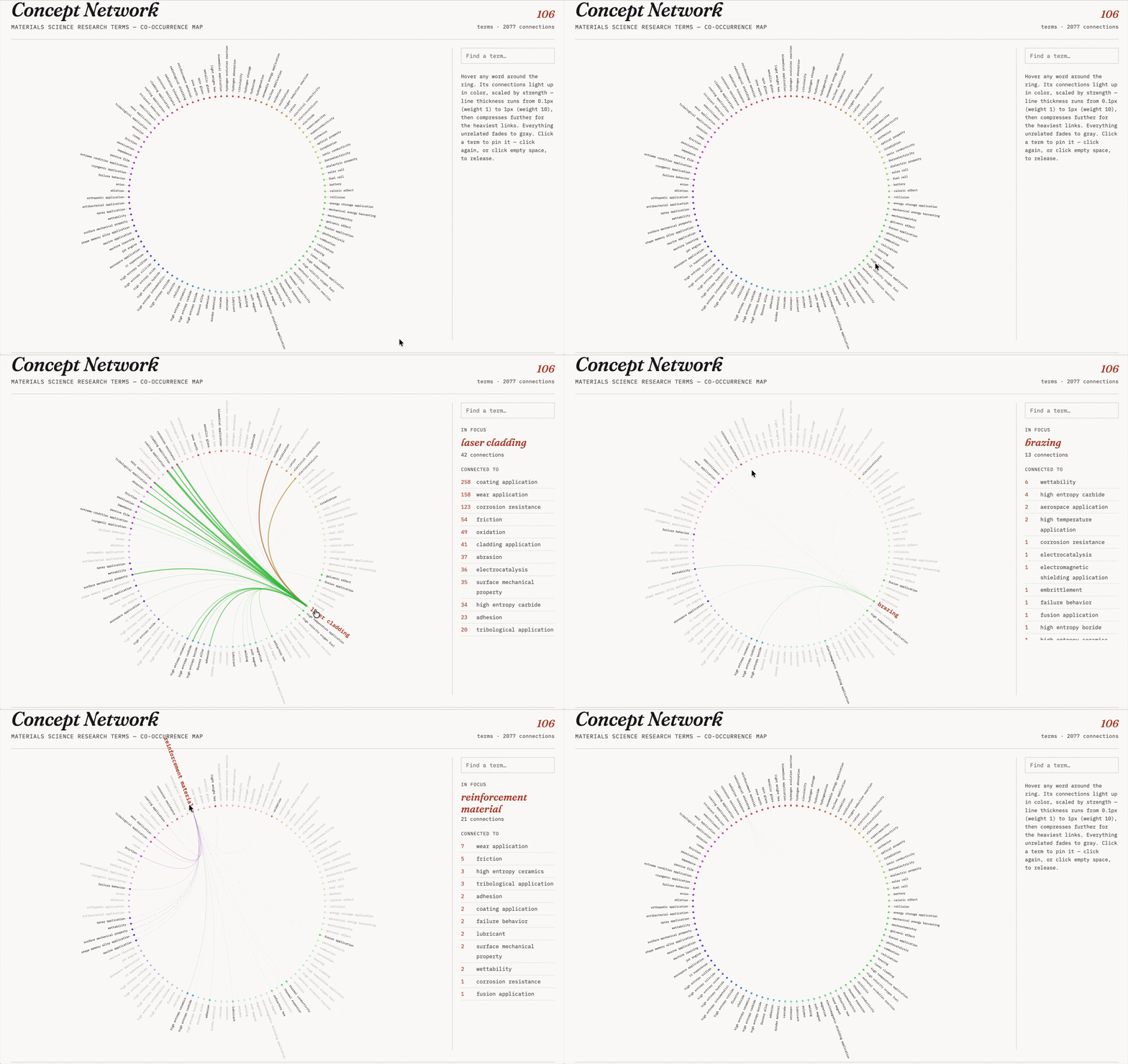
The challenge: Nearly 20 years of publication data across dozens of overlapping research themes — how do you reveal both the volume of research activity and the relationships between topics, without collapsing into visual noise?
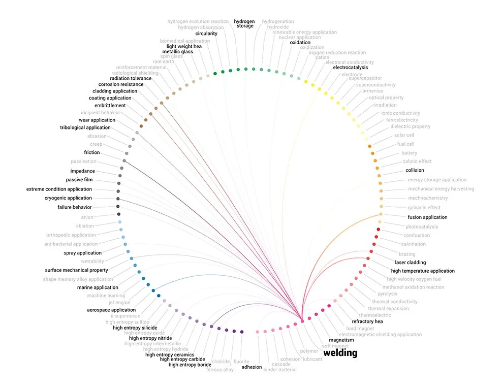
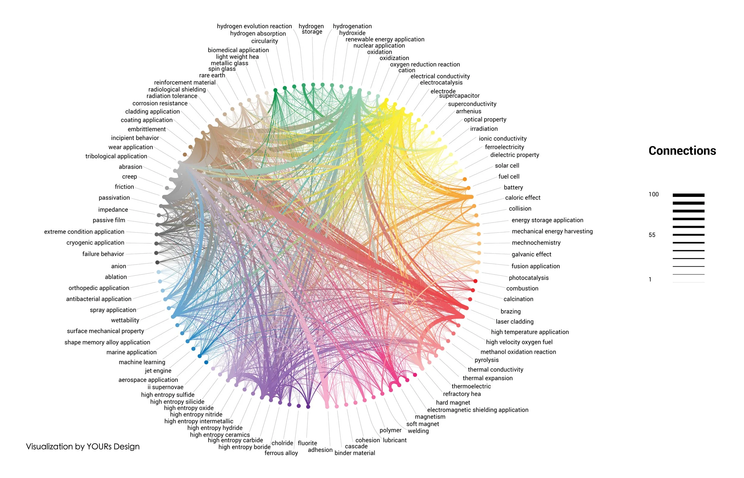
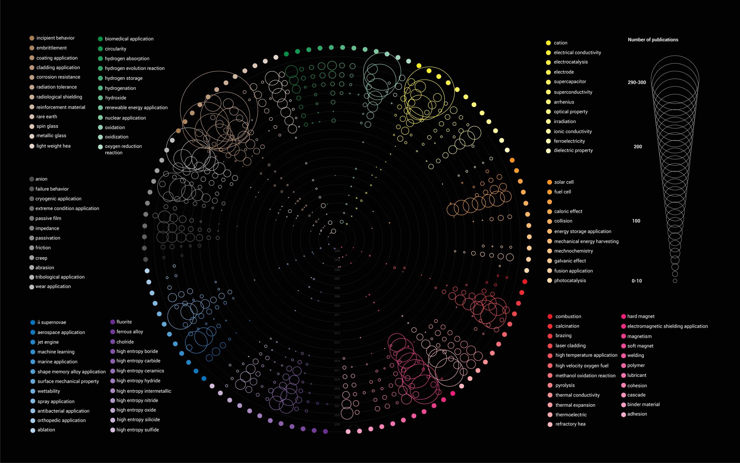
The approach: I designed two complementary views. A radial timeline maps publication volume by topic and year, using circle size to encode output and spatial position to reveal how research focus shifted over two decades. A network diagram then layers in the relational dimension — citation links between topics, with line weight showing citation intensity — surfacing interdisciplinary connections that the timeline alone can't show.
The result: A two-part visual system that turns a large bibliometric dataset into an explorable overview — useful for grant reports, institutional reviews, and communicating research strategy to non-specialist stakeholders.
Sketches
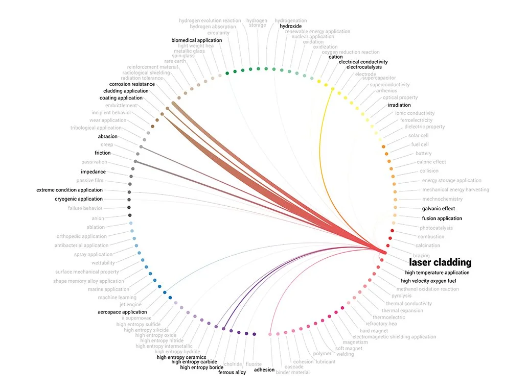
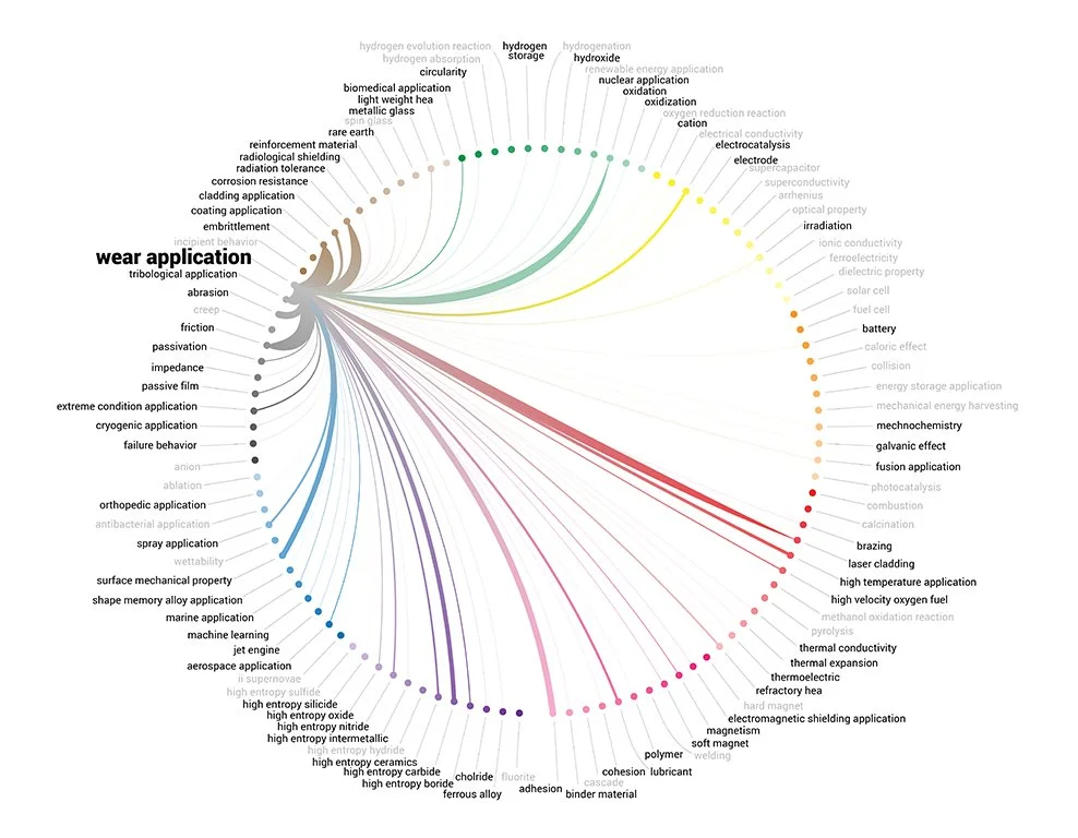
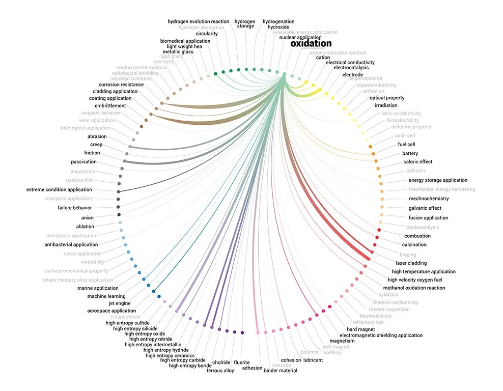
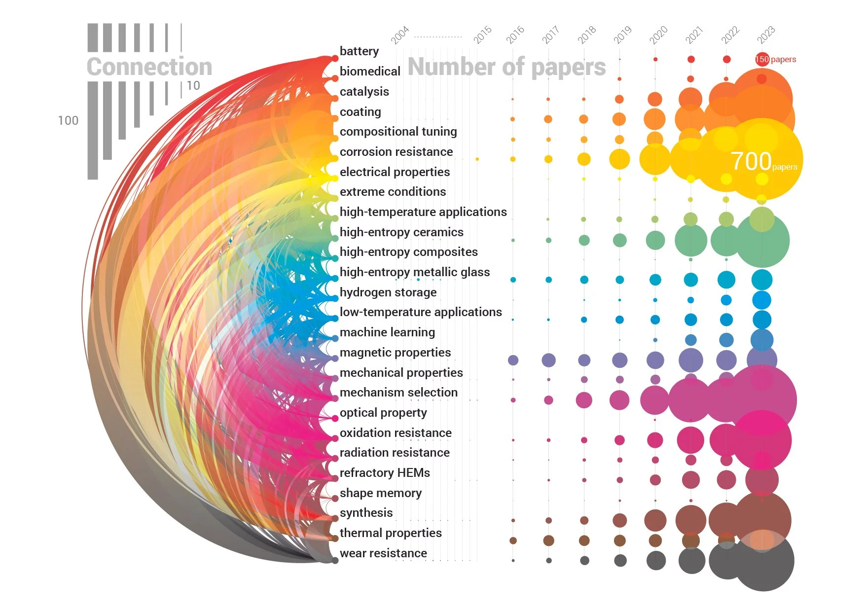
Simplified version
This work was created in collaboration with Max-Planck-Institut for sustainable materials. All rights reserved. Please do not reuse without permission.